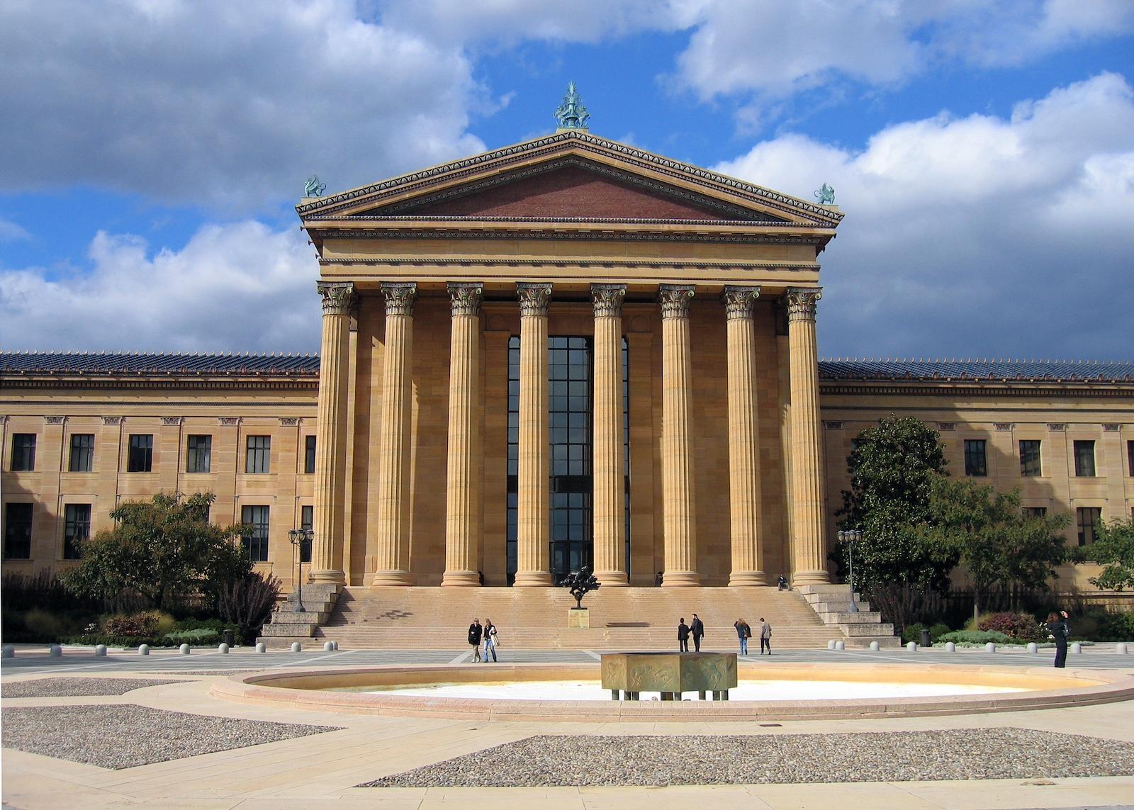
Shortly after the slimmed-down name was introduced, Philadelphia locals began referring to the 149-year-old museum as “PhArt,” rather than the intended “PhAM.” A stylized eagle introduced as the new logo ruffled just as many feathers, despite its similarity to the original 19th century version when the institution was known as the Pennsylvania Museum and School of Industrial Arts. In the wake of public outcries against the rebrand, Director and Chief Executive Sash Suda was dismissed only three years into her five-year contract. Suda previously served as the National Gallery of Canada’s director and was selected during an international search for refreshed leadership after the previous director retired following their admission to mishandling misconduct allegations against a manager.
This is also not the first rebrand by a major American institution to receive such swift disapproval. In 2016, the Metropolitan Museum of Art’s refreshed logo and imagery was heavily criticized by local newspapers and New Yorkers alike. An architecture critic at New York Magazine called it a “graphic misfire.” When the Brooklyn Museum rebranded in 2024 to celebrate its 200th anniversary, some argued that it was too bright and bold for a space claiming to uphold a proud history of American art.


