Museum  November 12, 2025  Annah Otis

“PhAM” Criticism And Other Museum Rebranding Missteps

WikiCommons

Philadelphia Art Museum. License.

The cultural heritage and history that art museums hold have traditionally made it harder for them to position themselves as vanguards of modernity and progress. In recent years, many institutions have attempted to step more fully into the 21st century with visual and narrative rebrands, but not all to positive reception. The Philadelphia Museum of Art’s transition to the Philadelphia Art Museum with a new logo has reached national news for its failure to capture public buy-in and the director’s resulting dismissal.

WikiCommons

Former Philadelphia Art Museum Director Sasha Suda. License.

Shortly after the slimmed-down name was introduced, Philadelphia locals began referring to the 149-year-old museum as “PhArt,” rather than the intended “PhAM.” A stylized eagle introduced as the new logo ruffled just as many feathers, despite its similarity to the original 19th century version when the institution was known as the Pennsylvania Museum and School of Industrial Arts. In the wake of public outcries against the rebrand, Director and Chief Executive Sash Suda was dismissed only three years into her five-year contract. Suda previously served as the National Gallery of Canada’s director and was selected during an international search for refreshed leadership after the previous director retired following their admission to mishandling misconduct allegations against a manager.

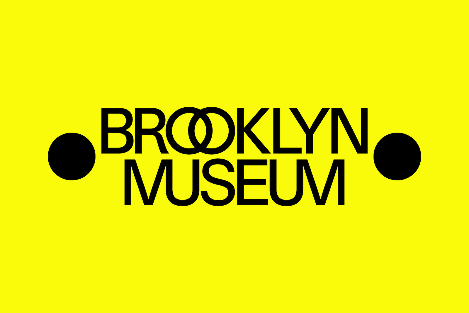
This is also not the first rebrand by a major American institution to receive such swift disapproval. In 2016, the Metropolitan Museum of Art’s refreshed logo and imagery was heavily criticized by local newspapers and New Yorkers alike. An architecture critic at New York Magazine called it a “graphic misfire.” When the Brooklyn Museum rebranded in 2024 to celebrate its 200th anniversary, some argued that it was too bright and bold for a space claiming to uphold a proud history of American art.

WikiCommons

The Brooklyn Museum’s refreshed logo. License.

Less controversial was the Guggenheim’s 2025 introduction of a new logo, open-source typeface, and icons. The attempt to unite its multiple international locations through a single, abstract “G” seems to have been well-received. However, this may be because it was the first logo to be used in association with the Guggenheim, not a replacement for an already beloved one. It therefore offered an interpretation of the museum that did not feel like it was encroaching on an old one.

In cities like Philadelphia or New York, where art museums are an established part of local culture, it is understandable that some might interpret attempts to redefine them as an unwelcome affront. Change is always hard, but particularly when it challenges perceptions of identity or belonging. Cultural institutions are already struggling to reassert their importance in an increasingly digital world, and backlash for branding decisions is adding to the challenge. Nonetheless, the additional media coverage could very well catch the attention of potential new visitors, an outcome any rebranding initiative could count as a win.

About the Author

Subscribe to our free e-letter!

Webform
Art and Object Marketplace - A Curated Art Marketplace